How it works
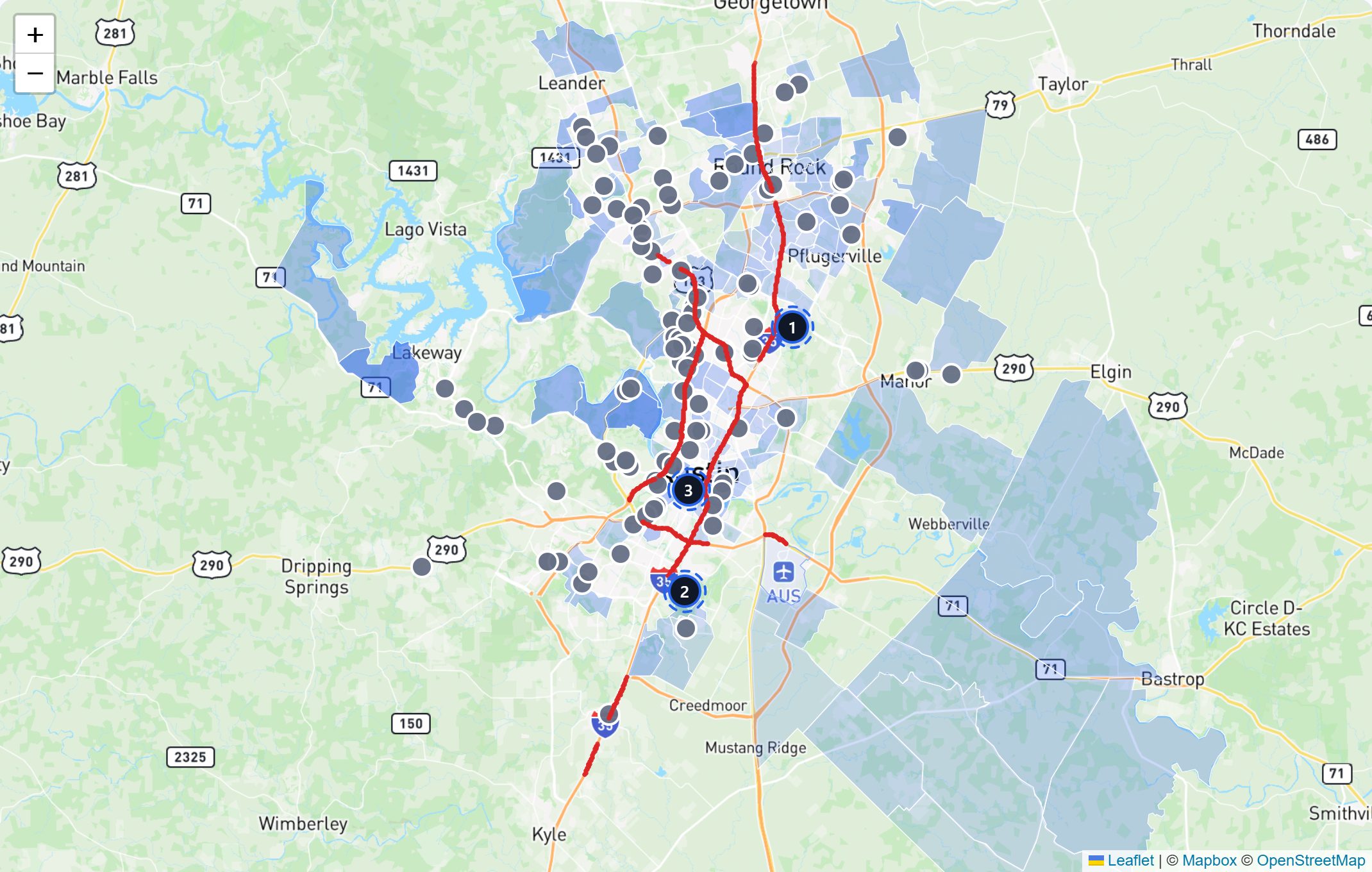
We pull Census counts for your customer group in every tract of the city. Then we paint them on the official tract shapes. Competitor pins sit on top. One look shows which side of town is served and which is not.
Source: US Census tract data, official boundary files.
What you do with it
- Pick the side of town before the street.
- Show a client where their customers live.
- Feed the gap finder.
How it is built
The map colours real census tract boundaries, not a grid or a heat blob. Tracts are the smallest geography with reliable published demographics, roughly a neighborhood in size, which is the resolution a siting decision actually needs.
You can shade the map by any combination of income, home value, rent, poverty, age, education, household size, density and the largest population group. Selecting several blends them, so darker means better on the combination you chose rather than on one hidden default. A second set of bracket filters layers on top, where darker means a neighborhood matches more of the conditions you set.
Suggested locations are ranked by a fit score weighted for the trade being sited. A walk-in business is scored on footfall and road traffic; an appointment or high-ticket business is scored on income and distance from competitors. Each pin then snaps to the busiest non-highway road inside its own neighborhood, because a site needs frontage and nobody opens on an interstate.
What it does not do
Every method has edges. These are the ones worth knowing before you lean on this.
- Tract demographics come from the most recent published survey, so they describe the recent past rather than this month.
- Health measures are shown only for health trades, where they are relevant.
- A twenty mile radius is too coarse in the densest metros, where it can sweep in several distinct submarkets.
Common questions
Can I change the radius?
Yes, from three to forty miles. The map reframes and rescores as you move it, which usually changes which neighborhoods look best. The report score stays anchored to the standard radius so comparisons between cities stay fair.
Why is a suggested pin not in the centre of its neighborhood?
Because the centre of a neighborhood is often a river, a park or the back of a subdivision. Pins are placed on a point genuinely inside the area and then moved to the best road in it.