How this market works
Restaurants are the highest volume and lowest margin category here, and the one where location matters most literally. Foot traffic, road frontage and the surrounding daytime population decide outcomes more than city-wide demographics do, which is why the neighborhood map and the traffic layer carry more weight in this vertical than anywhere else.
The category is also the hardest to count, because Google files eating places under many sibling categories. A search for one category finds roughly half the real market, so the report queries six of them together to get an honest competitor count.
Is there room for another restaurant here, and what would it be worth?
What this market looks like nationally
We measured these from live business listings across six mid-size metros and from published federal business statistics. They are the yardstick every scan is scored against, so a city reading above or below them is the actual signal.
In a city of 250,000 that works out to roughly 665 restaurants sharing a market of about $283M a year. Your city will differ, which is the point of scanning it.
What the report shows
- Measured vehicles per day on the roads around any site you are considering.
- Busy hours through the day, averaged from real foot traffic where it exists.
- Population density and daytime activity by neighborhood.
- Competing restaurants across six category types, not just one.
Every figure names its source and shows the arithmetic behind it, so you can argue with any input rather than taking a score on faith. See how the math is shown.
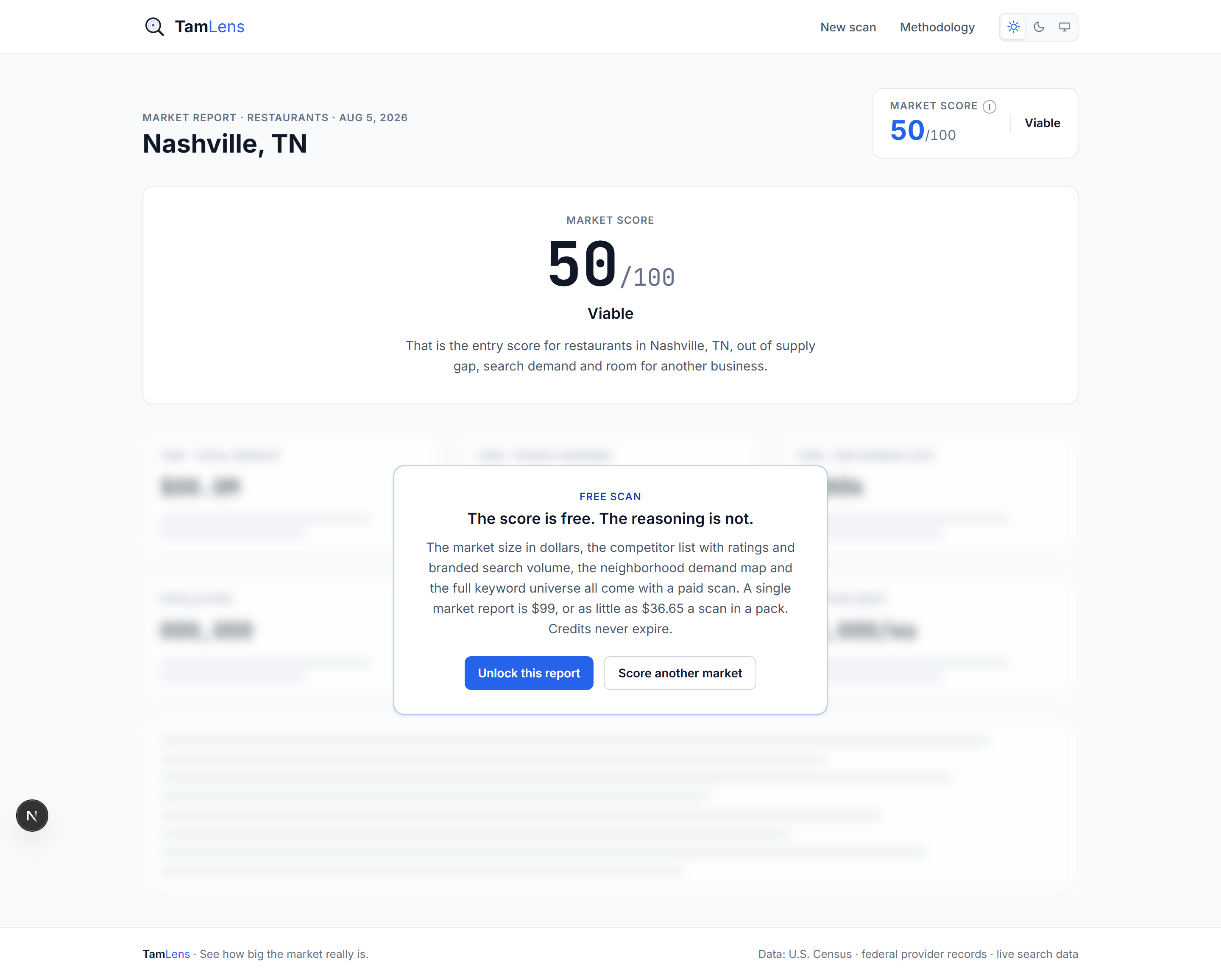
A real scan: Nashville, TN
Busy hours through the day
Who runs this scan
Operators picking a site, franchise developers screening territories, and landlords testing what a space could support.
Common questions
Does it cover fast food as well as full service?
Yes. The competitor count spans full service, fast food, pizza, sandwich and two cuisine categories, because counting only one badly understates the market.
Where do busy hours come from?
Real foot traffic patterns averaged across the competitors in the area. They exist for walk-in businesses and are shown as not applicable for trades that visit customers.
Is delivery demand included?
It appears in the keyword universe as delivery and takeout intent, but the report does not model third-party platform economics.